Ifeoluwa Emmanuel
Personal Banking & Fintech

VPDMoney

VPD Money is a Nigerian fintech platform targeting the unbanked and underbanked. I joined the team to lead the 2.0 redesign, inheriting prior research and a design system, then driving UI/UX improvements that grew the active customer base from 12,000 to 35,000.

VPD Money banner
My RoleUI/UX Designer
Duration8 weeks
DisciplinesMobile Product Design, UI Redesign, Design Systems
Year2023

Overview

/Challenge

VPD Money 1.4 had a functional foundation but fell short on accessibility, visual modernity, and the personalised experience that builds loyalty. The platform needed to feel as capable as its ambition, serving a diverse user base while staying intuitive for people encountering digital banking for the first time.

/Solution

A comprehensive redesign of the core banking experience: guided onboarding, a customisable account system, a simplified dashboard, expanded payment flows, dark mode, and a segmented notification system. Each change was validated through internal review and usability testing before implementation.

Research

The work began by understanding the complete ecosystem, the people using it, and the moments where unclear structure created unnecessary friction.

01

Audited the 1.4 version to identify accessibility gaps and navigation friction across core flows

02

Reviewed prior research and user feedback inherited from the previous designer to avoid losing valuable context

03

Analysed the competitive landscape to identify where VPD Money could differentiate, particularly around customisation and borderless transfers

04

Prioritised improvements by user impact: onboarding clarity, dashboard usability, and payment comprehensiveness came first

Who this had to work for

Different lives.
Different stakes.

A useful product must understand what each person is trying to protect, avoid, and accomplish.

01 / Account executive, Lagos

Chiamaka

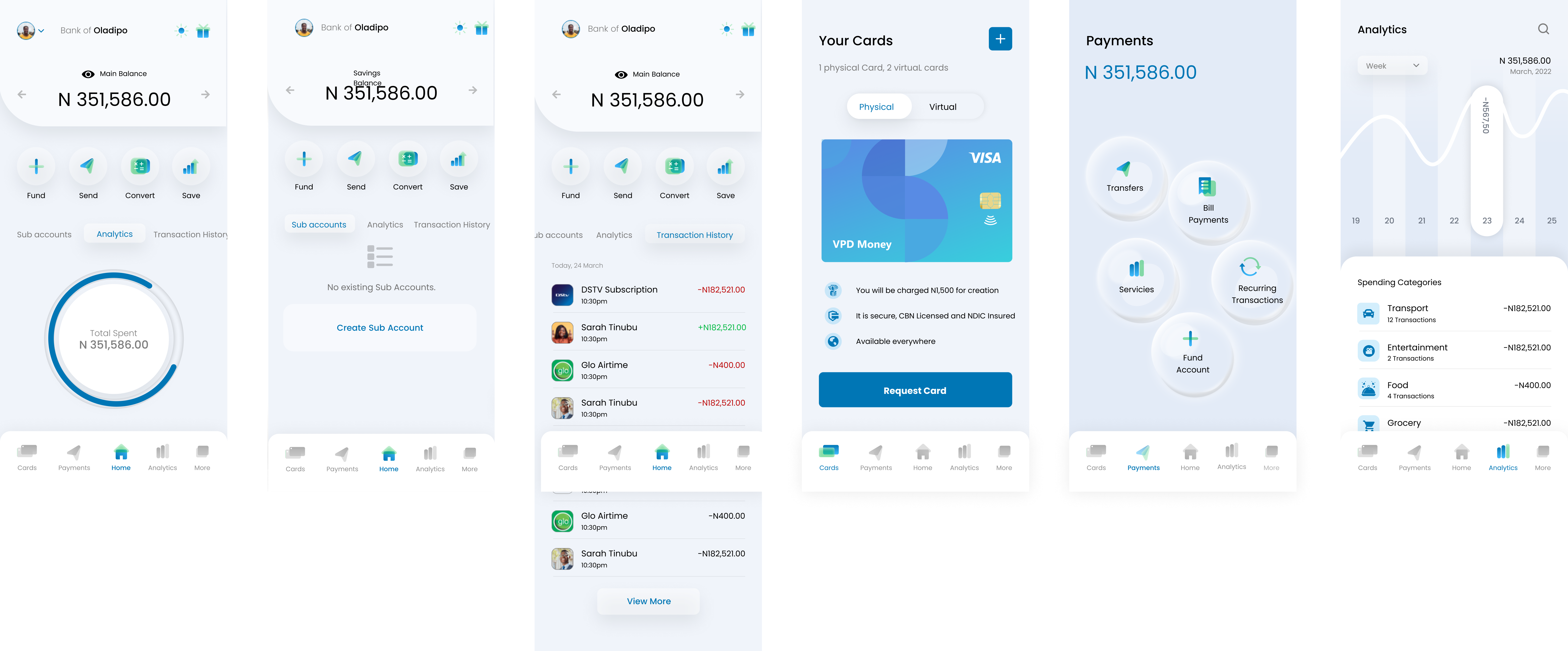
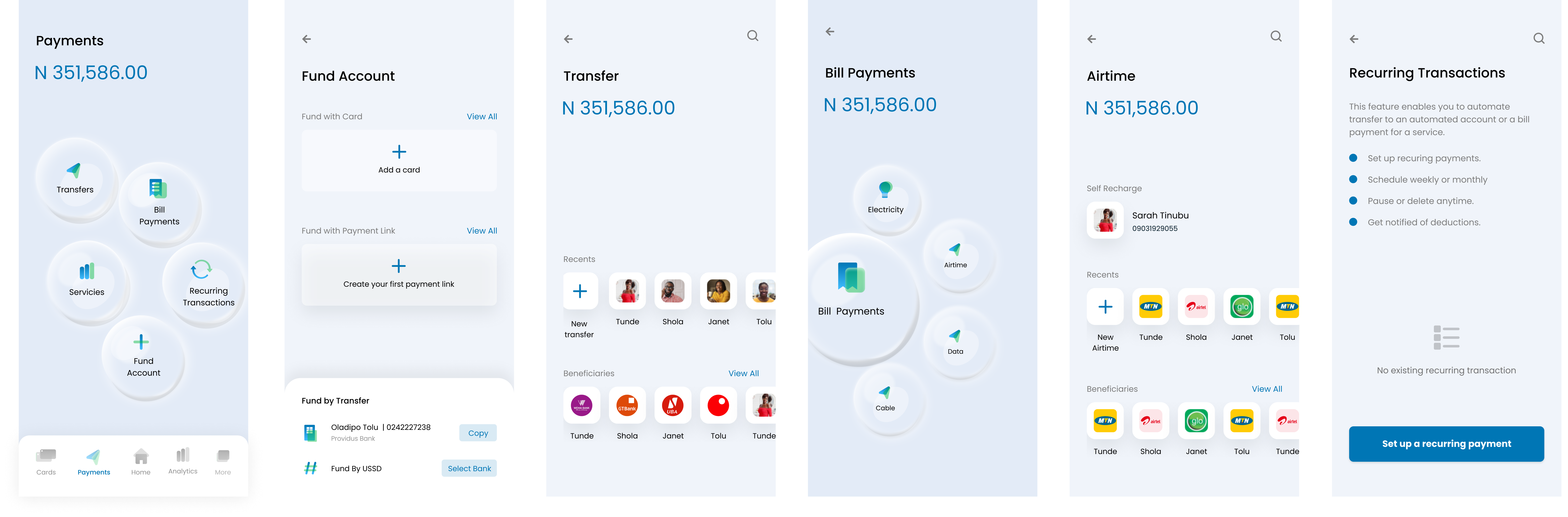
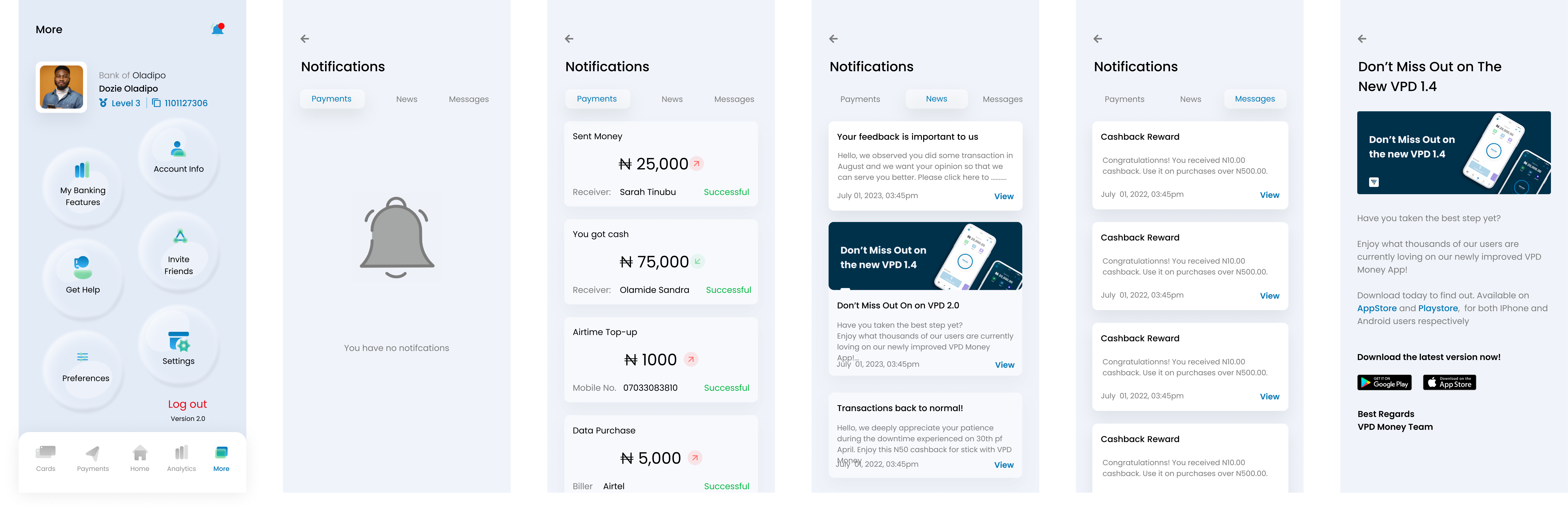
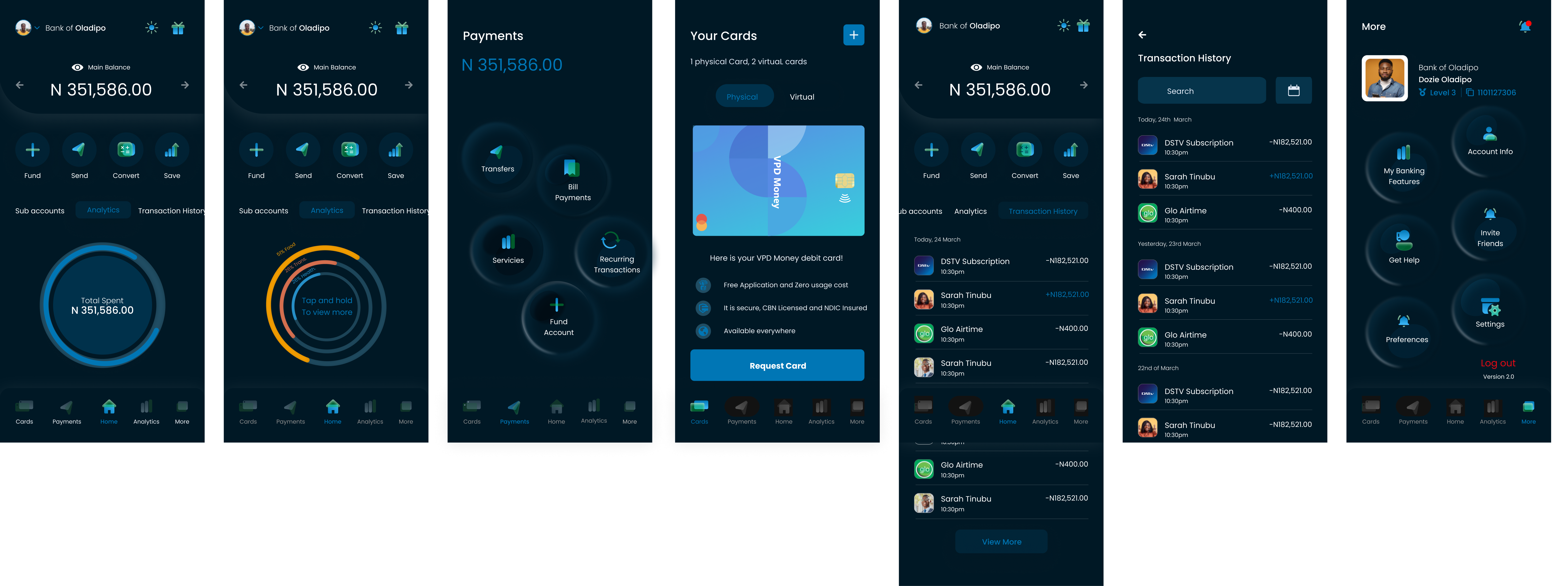
A young professional who handles all her finances on her phone, sending money home monthly, paying subscriptions, and splitting bills with flatmates. She evaluates a banking app the same way she evaluates any product: does it get out of my way?

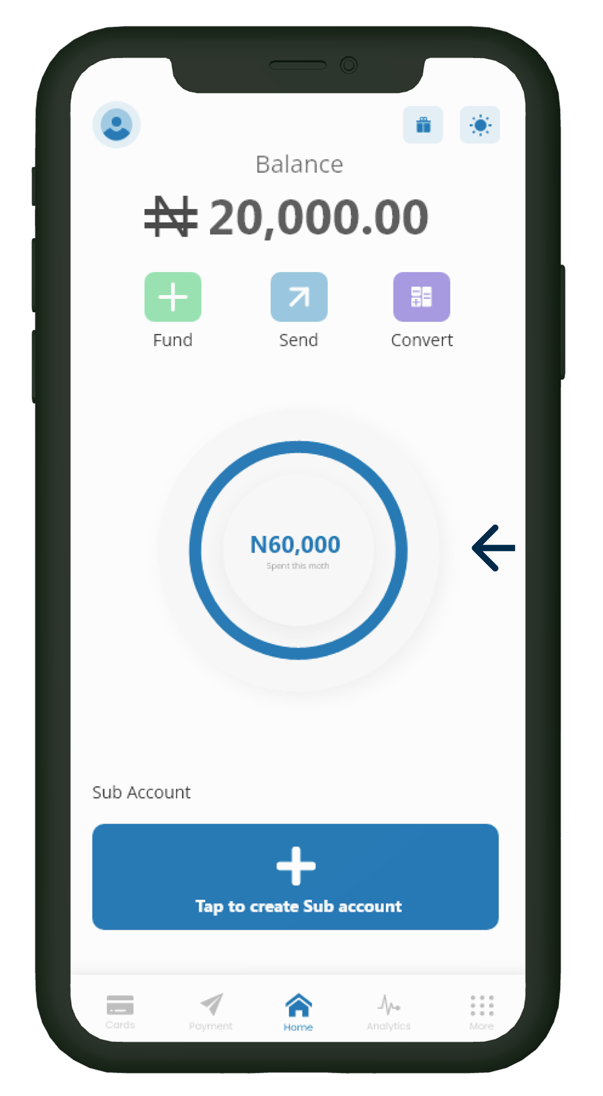
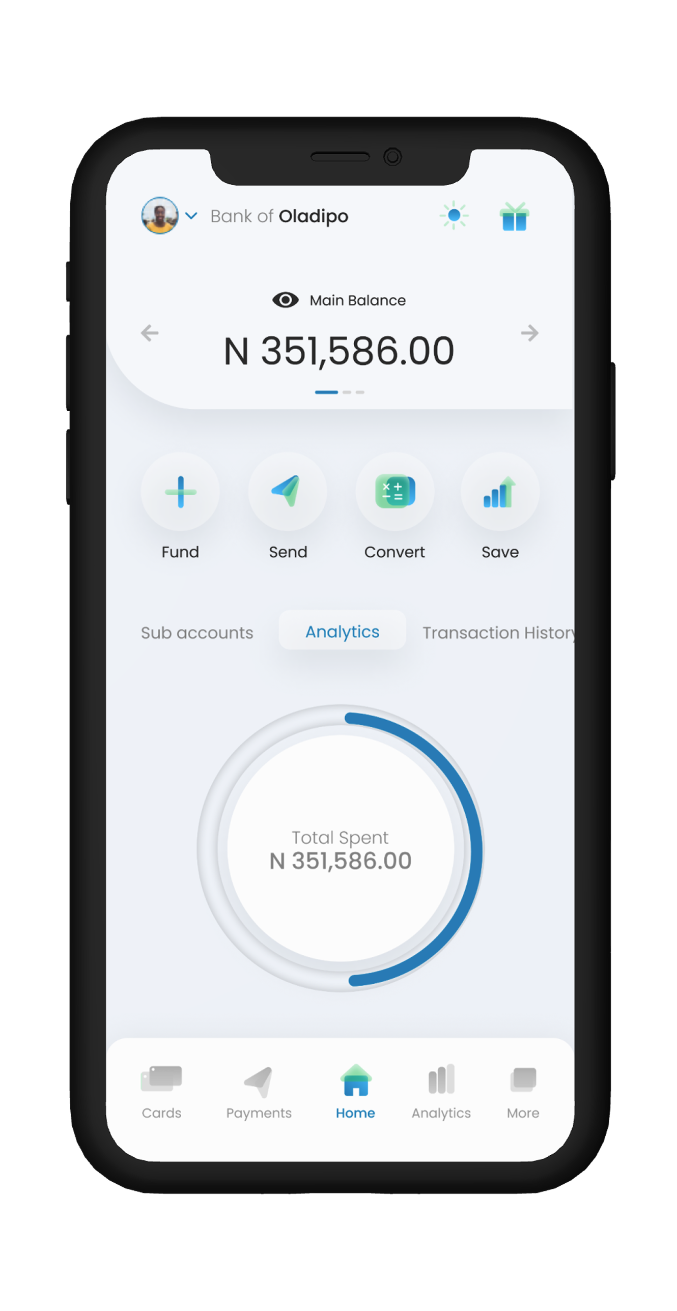
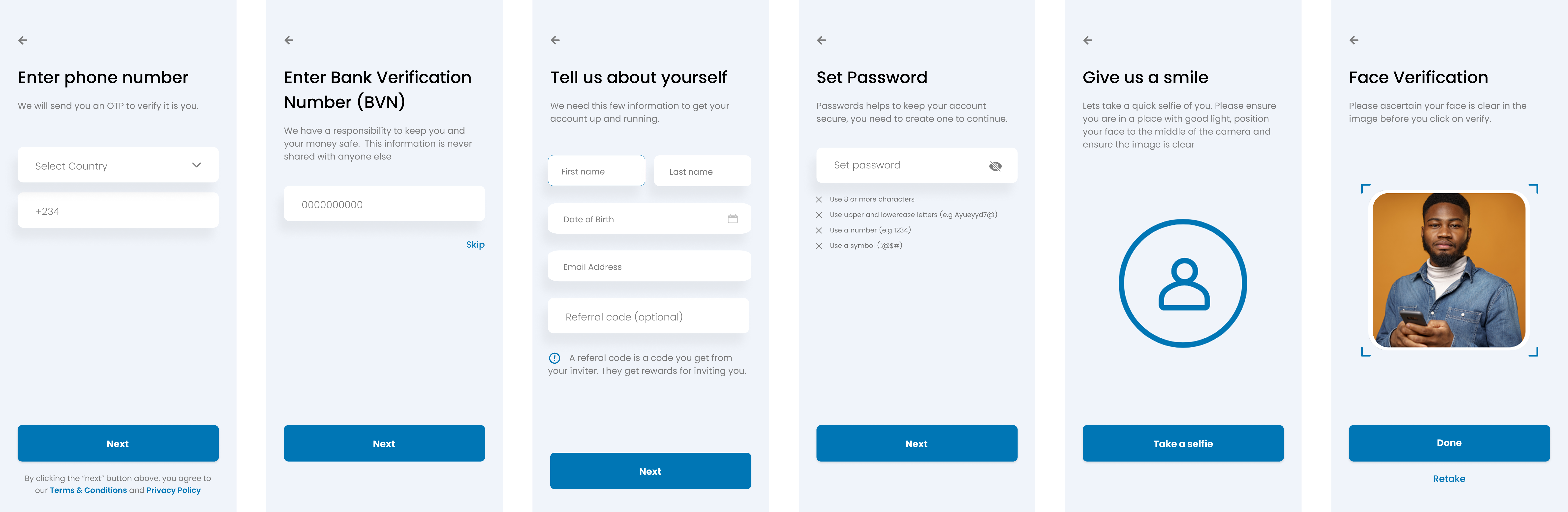
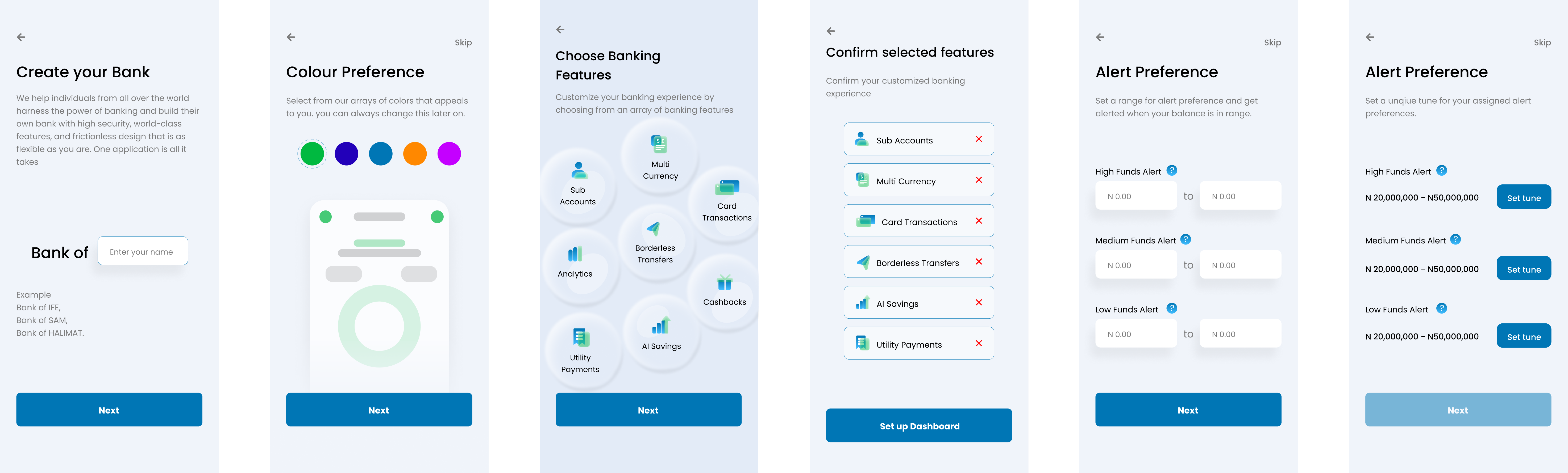
FrictionThe 1.4 interface forced her to hunt through menus for basic actions. She frequently landed in the wrong flow mid-transfer and had to start over, eroding trust in an app handling real money.
Success looks likeComplete every banking task in under 90 seconds without second-guessing herself. One tap to fund, one tap to transfer, done.
02 / Online merchant & micro-entrepreneur

Chidi

Runs a small clothing business, collecting payments from customers across Nigeria, pays suppliers, and tracks cash flow on his phone between fulfilment runs. VPD Money is both his business account and his personal wallet.

FrictionMixing personal and business transactions in one account makes it nearly impossible to tell how the business is actually doing at the end of the month.
Success looks likeAccept payments, pay out to suppliers, and see a clear picture of money in versus money out, without needing a separate account or spreadsheet.

Process

The design process translated those findings into a clear, scalable system. Each stage reduced complexity while preserving the personality and purpose of the product.

01

Audit & inherit

Reviewed the 1.4 product and inherited the design system and prior research. Conducted my own UX audit to build a clear picture of where the experience broke down before touching anything.

02

User-centric prioritisation

Focused improvements on the moments that mattered most: onboarding confidence, dashboard clarity, and payment reliability, rather than surface-level visual changes across the board.

03

Iterative design and development

Worked directly with developers to ship features incrementally, validating at each stage and adapting designs based on real implementation feedback.

04

Refinement and launch

Ran internal reviews and usability tests throughout to tighten interaction patterns and ensure the product felt cohesive before going live.

Product judgment

The decisions
behind the screens.

01

Make customisation the differentiator

No major competitor offered the ability to personalise your account name, colour theme, feature set, and alert preferences. Building this into the core onboarding experience made VPD Money feel like a personal bank, not just another shared platform.

02

Design onboarding for first-time digital banking users

A significant portion of the target audience was new to digital banking entirely. Onboarding avoided unnecessary data requests like gender, used plain language, and led users directly into customisation, making early ownership feel tangible.

03

Simplify the dashboard without reducing power

The 1.4 dashboard buried key actions inside navigation. The redesign surfaced funding, transfers, and bill payments at the top level, while sub-accounts and recurring payments remained accessible without cluttering the primary view.

04

Introduce dark mode as a user-requested feature

Multiple users had explicitly requested a dark theme. Adding it addressed a direct ask, followed modern design conventions, and improved readability in low-light conditions, a real consideration for a mobile-first, all-day banking app.

Before vs After

The home screen, redesigned.

Version 1.4 buried the most-used actions inside a dense layout. The 2.0 redesign surfaced what users actually reach for first, clearing everything else out of the way.

VPD Money 1.4 old home screen
Before

Version 1.4: generic balance view, 3 actions, sub-account buried below the fold

VPD Money 2.0 redesigned home screen
After

Version 2.0: personalised account identity, 4 actions, tabbed access to sub-accounts and analytics

Competitive landscape

Looking at the competition.

Understanding where VPD Money could differentiate and where table stakes already existed shaped every prioritisation decision. Research conducted in 2023.

Features
Customised Banking
AI Savings
Borderless Transfer
Digital / Offline Onboarding
Bill Payments
Virtual / Physical Cards
Lending & Loan Service
Scheduled Payment
Free Local Transfer
Cashback
Sub-Account / Multi-Currency

Onboarding Screens

The onboarding flow avoided unnecessary data requests and used clear, direct language to guide users through identity verification and account creation, reducing friction for people encountering digital banking for the first time.

VPD Money Onboarding Screens

Customization Experience

Immediately after onboarding, users could personalise their account name, choose a colour theme, enable specific banking features, and configure fund alert preferences, making the account feel personal from day one.

VPD Money Customization Experience

Simplified Dashboard & Menu

The redesigned dashboard surfaced core actions (funding, transfers, bill payments) without the clutter of the 1.4 layout. Sub-accounts, transaction history, and card management were accessible without navigating deep menus.

VPD Money Simplified Dashboard & Menu

Payments: Funding, Transfers and Recurring

A comprehensive payments experience covering account funding, external transfers, bill payments, and recurring transaction scheduling, all within a consistent, predictable flow.

VPD Money Payments: Funding, Transfers and Recurring

Notifications & More

The 'More' section and segmented notification system gave users granular control over banking preferences and communication, surfacing the right information at the right time without overwhelming the experience.

VPD Money Notifications & More

Dark Mode

Introduced following sustained user requests, the dark theme reduced glare, improved readability in low-light environments, and brought VPD Money in line with modern expectations for a daily-use financial app.

VPD Money Dark Mode
What I would carry forward

The work changed how I design.

01

Inheriting a project mid-stream demands respect for prior decisions. Understanding the reasoning behind existing patterns made it possible to improve what was not working without discarding what was.

02

Designing for the unbanked means designing for users who are learning digital banking and your product simultaneously. Inclusivity cannot be an afterthought, it has to shape how you write, structure, and sequence everything.

03

Collaboration across specialties like motion design, illustration, and content strategy, would have elevated the outcome further. A sole designer can ship a strong product, but a team of specialists creates a remarkable one.

Outcome

What changed
because of the work.

01

192% growth in active customers: from 12,000 to 35,000, directly following the 2.0 launch

02

Delivered a fully customisable banking experience: the only major Nigerian fintech offering account personalisation at this depth

03

Simplified onboarding reduced drop-off for first-time digital banking users joining from the unbanked segment

04

Dark mode and segmented notifications shipped as the two most-requested user improvements, resolved in a single release